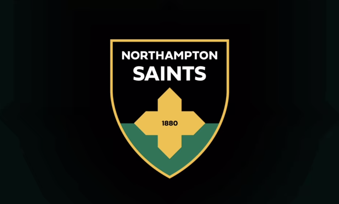
Northampton Saints fans have been left frustrated and disappointed by their newly released club badge, which has been based upon the original crest of 1880.
The updated image has followed much of the modern branding by other clubs, which has focused on a much simpler and more minimalistic style than the previous shield, focusing heavily on the club colours and symbolisms. Sadly for the designers, the end product has been totally rejected by fans.
View this post on Instagram
One fan mocked the fan research that was done into the new branding, saying:
“99% said an impactful visual identity is crucial.
90% said the club’s history is important to them.
75% said our black’ green and gold are the most important part of our identity.
99% say this looks crap.”

Here are the top comments from other fans on Northampton Saints’ social media posts:
“Those who said change did not mean this. It looks thrown together at the last minute. So much more could’ve been done to honour the club’s history as well as the town. This is a mockery.”
“This is probably the worst badge I’ve ever seen.”
“That is such an unbelievable downgrade, what were they thinking.”
“Wtf…which nursery won the prize for designing the new badge?”
“It’s like a pro evo soccer badge who can’t get the fifa license! May as well start calling us East Midlands North Green as well.”
“Completely unnecessary. Read the comments, interesting to see how long this post remains up. Stinks of marketing bods validating their own jobs.”
Sign In